flex布局属性可以快速满足我们日常开发的常见布局需要,解决使用定位、浮动等影响其他元素的属性。
浏览器支持如下,IE10以下需要做兼容性处理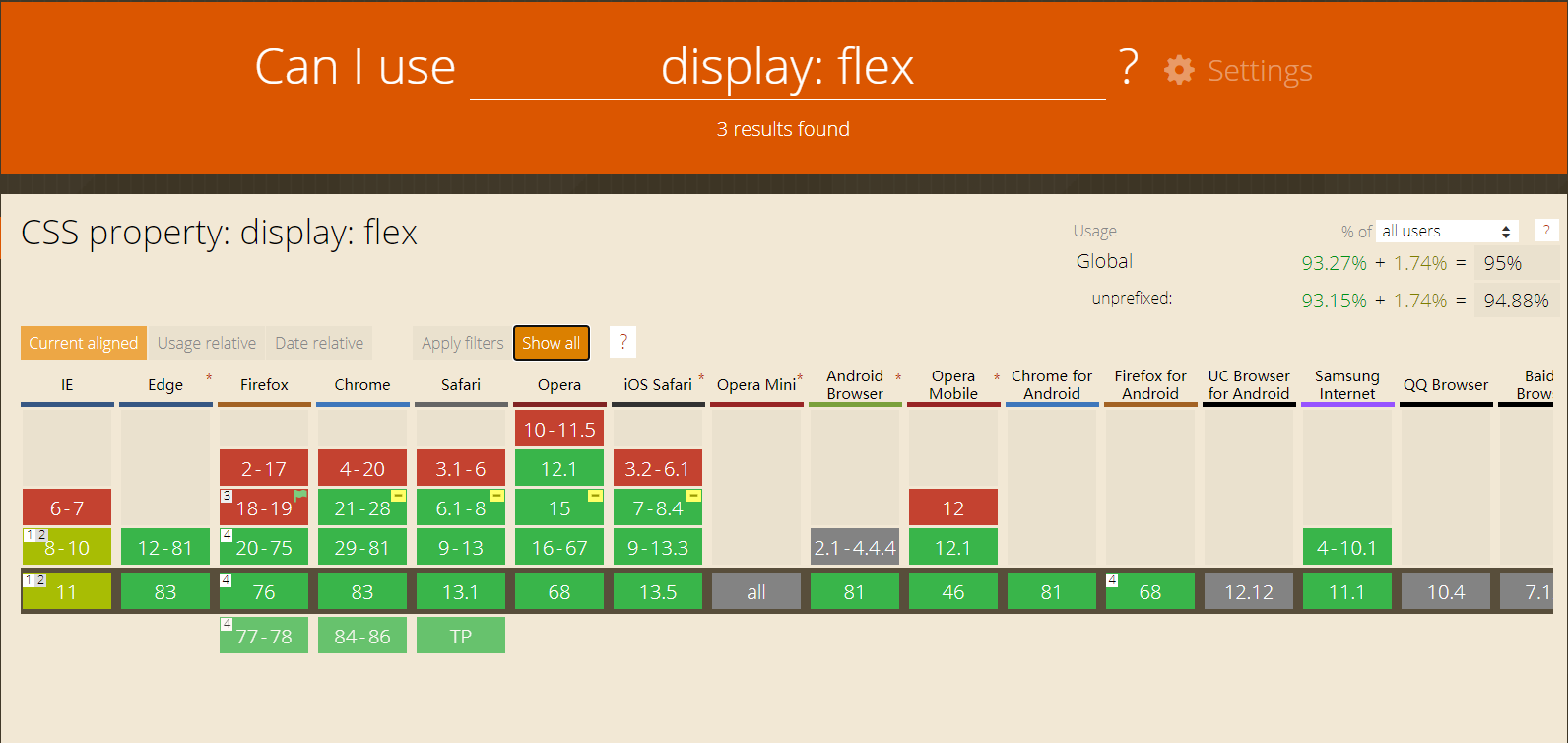
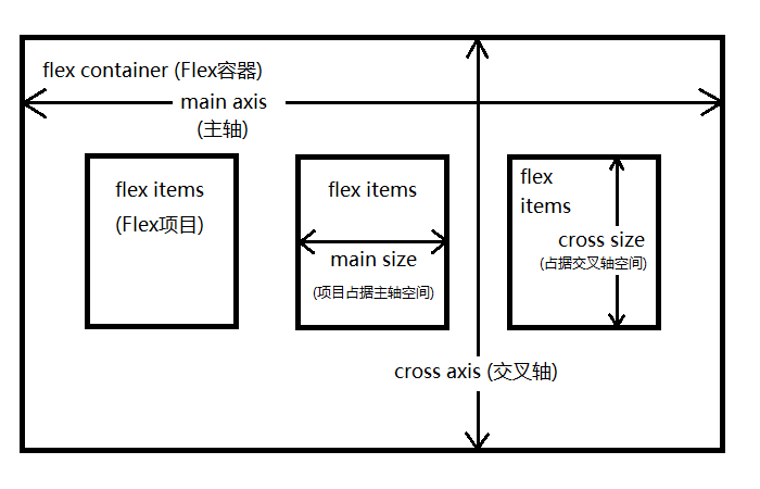
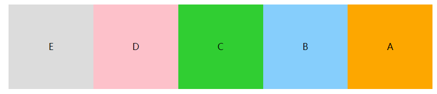
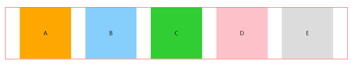
flex布局的容器存在主轴(main axis)和交叉轴(cross axis)
默认情况下主轴是水平的
1
2
3
4
5
6
7
8
9
10
11
12
13
14
15
16
17
18
19
20
21
22
23
24
25
26
<!-- 节点结构 -->
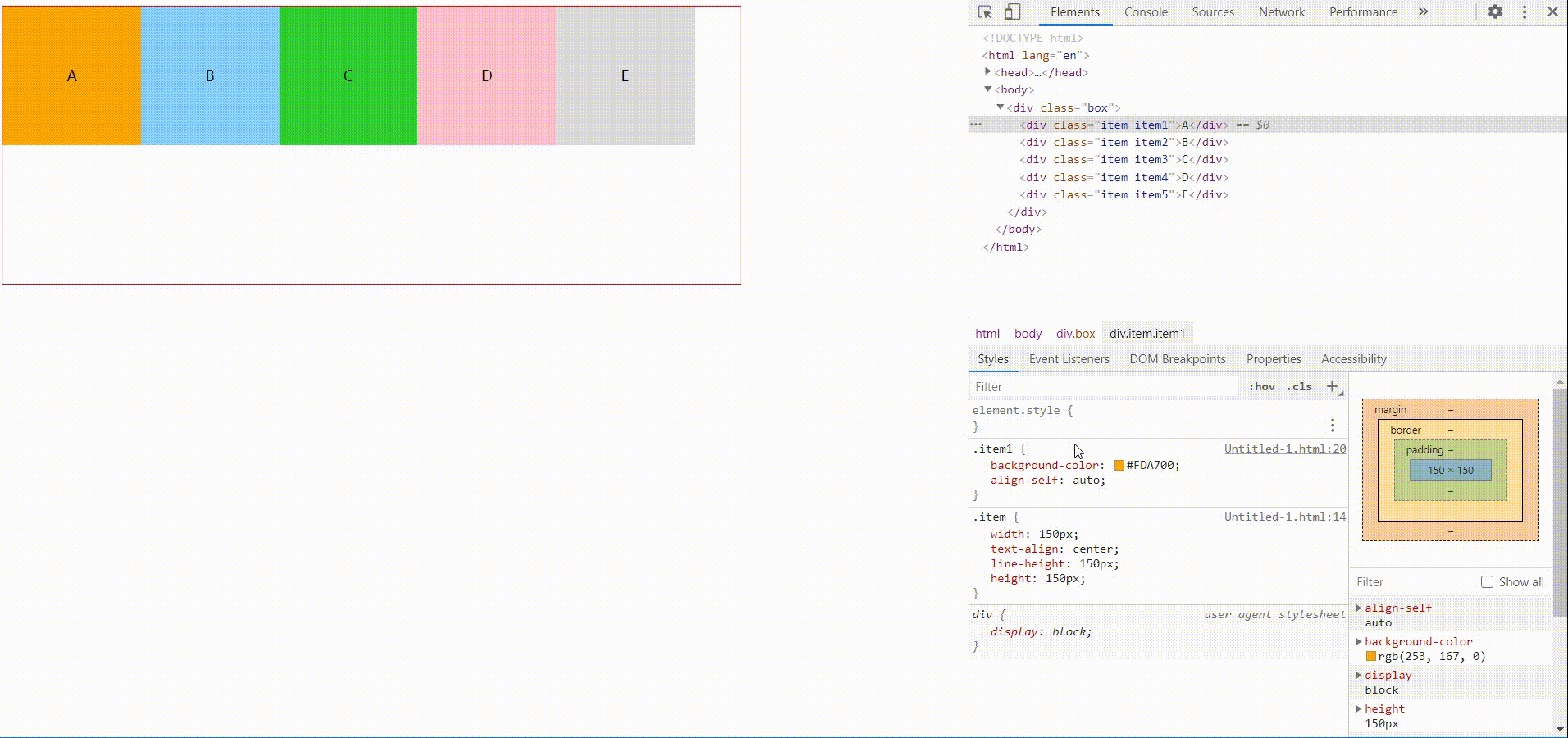
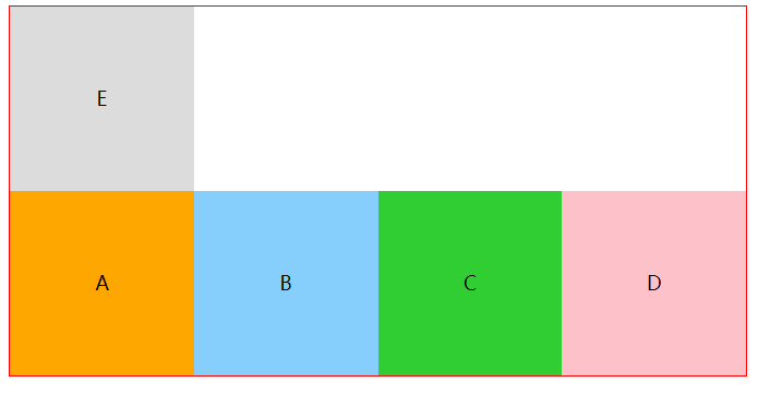
<div class="container">
<div class="box">
<div class="item item1">A</div>
<div class="item item2">B</div>
<div class="item item3">C</div>
<div class="item item4">D</div>
<div class="item item5">E</div>
</div>
</div>
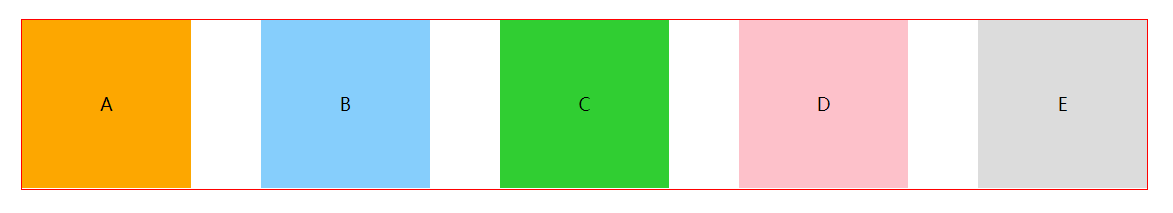
.box{
border: 1px red solid;
width: 800px;
display: flex;
}
.item {
width: 150px;
text-align: center;
line-height: 150px;
}
.item1 { background-color: #FDA700; }
.item2 { background-color: #86CEFC; }
.item3 { background-color: #30CE32; }
.item4 { background-color: #FDC1CA; }
.item5 { background-color: #DCDCDC; }
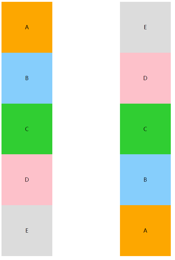
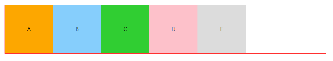
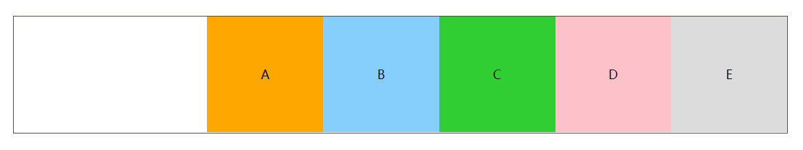
flex-direction
flex-direction决定了元素如何排列,默认横向row
1 | .box{ |
row
row-reverse
column、column-reverse
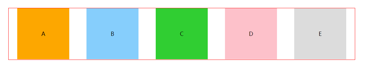
flex-wrap
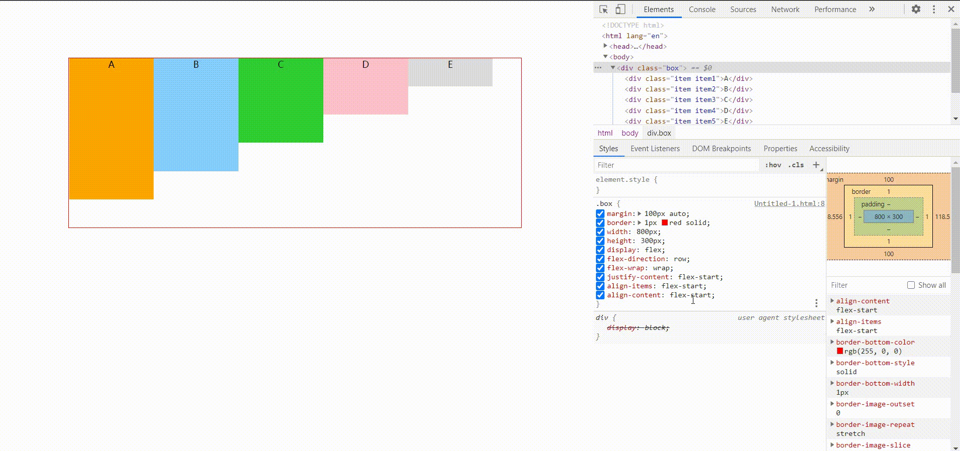
flex-wrap决定了主轴内容超出时如何换行,默认不换行nowrap
1 | .box{ |
nowrap
设置为nowrap时,子元素宽度无效,会根据容器宽度自适应,撑满容器1
2
3
4
5
6
7
8
9
10
11
12
13
14
15
16
17
18
19
20
21.box{
border: 1px red solid;
width: 600px;
display: flex;
flex-direction: row;
flex-wrap: wrap;
}
.item {
width: 150px;
height: 150px;
text-align: center;
line-height: 150px;
}
<!-- 此处测试根据内容调整宽度,修改了内容 -->
<div class="box">
<div class="item item1">A</div>
<div class="item item2">BASDFASDFSDFASDASDASDASDAAS</div>
<div class="item item3">CAS</div>
<div class="item item4">DDDDDDSDDD</div>
<div class="item item5">EAAAA</div>
</div>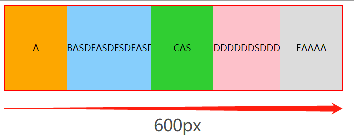
wrap
wrap-reverse
flex-flow
该属性是flex-direction和flex-wrap的简写方式,默认值flex-flow: row nowrap
1 | .box { |
justify-content
该属性定义了元素如何在主轴上排列、分配空间,默认值justify-content: flex-start
1 | .box { |
flex-start
flex-end
space-around
space-between
space-evenly
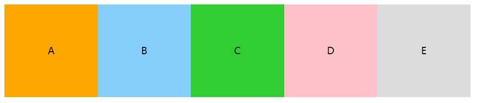
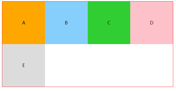
align-items、align-content
MDN解释:
align-items属性将所有直接子节点上的align-self值设置为一个组。 align-self属性设置项目在其包含块中在交叉轴方向上的对齐方式。
align-content 属性设置了浏览器如何沿着弹性盒子布局的纵轴和网格布局的主轴在内容项之间和周围分配空间。
如图所示,五个子节点作为一整块。
flex-start / stretch / baseline 在交叉轴上从容器头部开始排列
center 在交叉轴上居中排列
flex-end 在交叉轴上从尾部开始排列
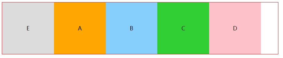
order
order属性定义项目的排列顺序。数值越小,排列越靠前,默认为0。
flex-grow
该属性是指当子元素总宽度和比盒子宽度小的时候,子元素该如何瓜分父元素剩余宽度。使用后子元素实际宽度和会等于父容器宽度。
flex-shrink
与flex-grow相反,该属性是指当子元素总宽度和比盒子宽度大的时候,子元素该如何压缩自己适应父元素宽度。使用后子元素实际宽度和会等于父容器宽度。
flex-basis
MDN定义:指定了 flex 元素在主轴方向上的初始大小
项目(item)放进盒子之前,给出一个初始宽度,默认值为auto,即项目本身的实际宽度,浏览器会根据 flex-basis 计算主轴是否有剩余空间。与width效果一样,但是优先级高于width。
max-width/min-width > flex-basis > width > box
flex
flex属性是flex-grow, flex-shrink 和 flex-basis的简写,默认值为0 1 auto
align-self
align-self属性允许单个项目有与其他项目不一样的对齐方式,可覆盖align-items属性。默认值为auto,表示继承父元素的align-items属性。
例如:给其中一个元素设置align-self